Analysis of Data
- Transfer your data into a Microsoft Excel spreadsheet. Make sure to label the columns and rows so it is easy to read.
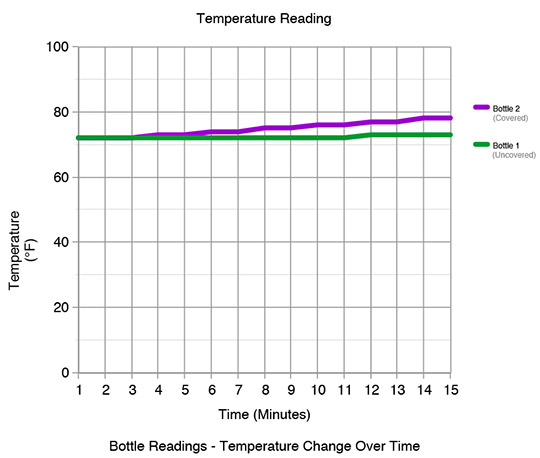
- Then, create a graph of your data with the independent variable on the X axis and the dependent variable on the Y axis. Be sure to graph data for both bottles on the same graph. This graph should appear on the same sheet as the data. Use a different color for each line. If you need help with creating a graph, click here.
Source: WeatherSTEM