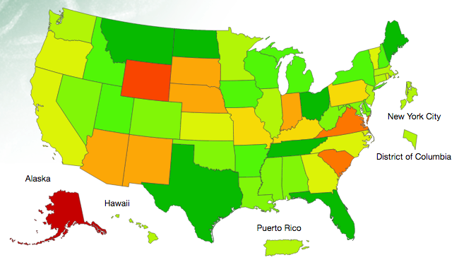
Current Influenza Cases
This interactive map from the Centers for Disease Control (CDC) reports the activity of influenza in the United States. Click on the map, or link, to open a new browser tab. Use the slider to explore how the disease has spread over the past four months.
Do you see any interesting patterns in the data?