Forecast Chart Comparison
Both of the models below show the forecast for June 23, 2015 and were made on June 19, 2015. They both use the same observational data. What are some of the differences and similarities?
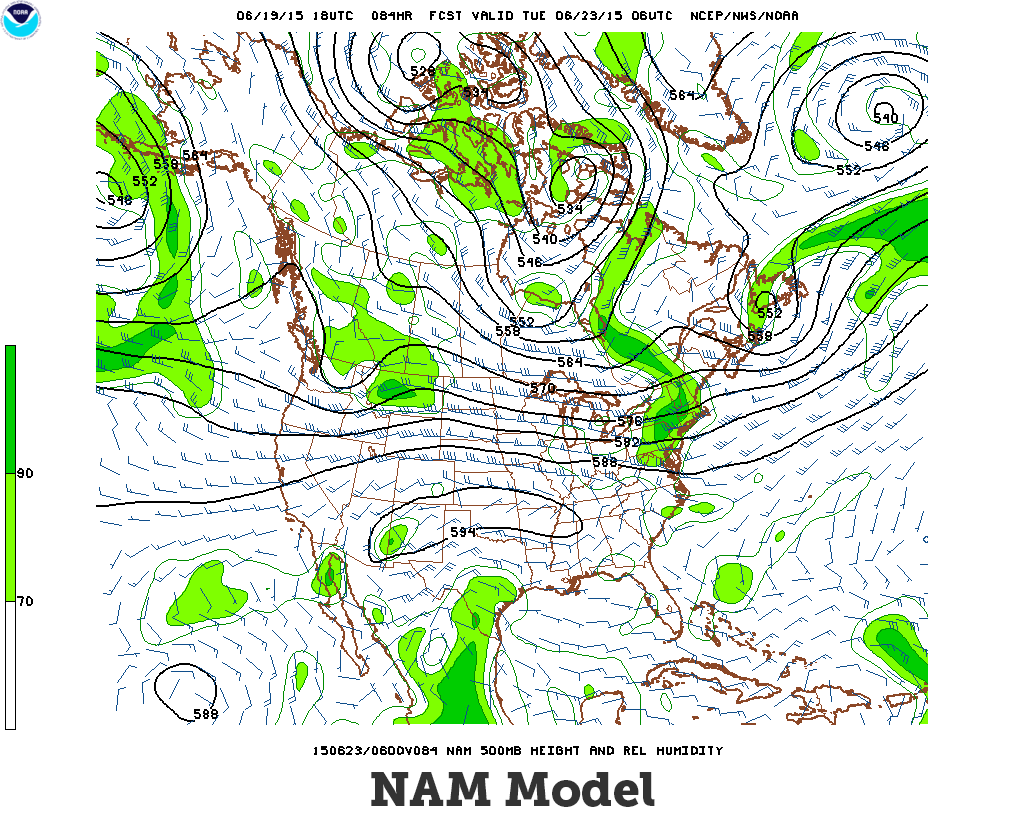
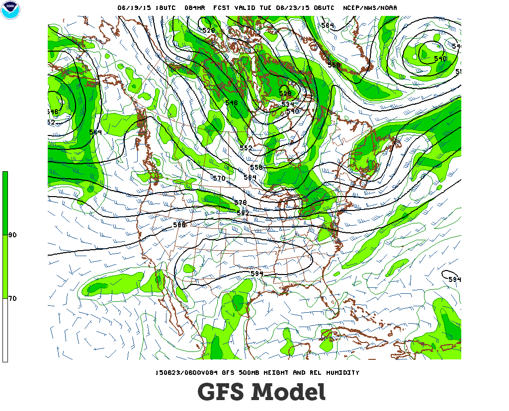
Drag the slider handle below to examine the differences between forecasts created using the two different models shown above (NAM Model and GFS Model).
About the chart above: 1) Relative humidity at 500 mb as a percentage. Values 30% and 50% are displayed as contours, 2) Values 70% and higher are displayed as color fill. Isopleths as black lines expressing the height of the 500 mb level in decameters (dm) with an interval of 6 dm, and 3) Wind in Knots at 500 mb expressed as wind barbs.
Forecast Model Images from: Model Analyses and Guidance | NOAA